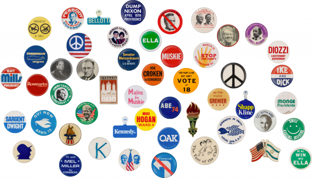
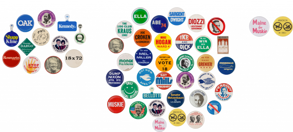
For this brief I selected items from the Harvard Digital Collections Political Buttons collection and chose content from pages 1 through 5.
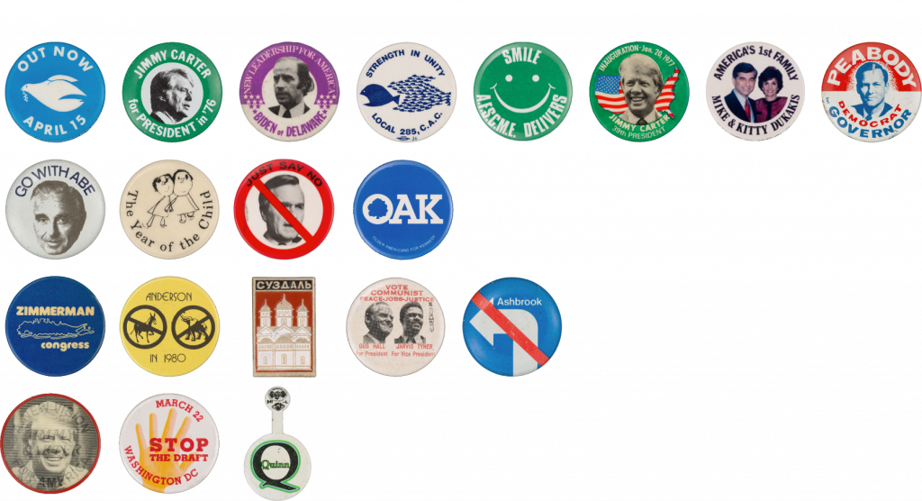
Sorting By Content Expression
Classifying political pins based on their expressed content aims to uncover the social and political messages behind these items.
Different types of pins reveal people’s attitudes toward political figures or policies and reflect the collective emotions of a specific time period. This approach helps me understand the focal points of public attention and controversy in history.
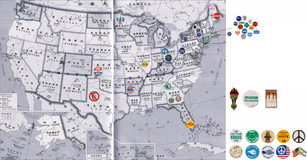
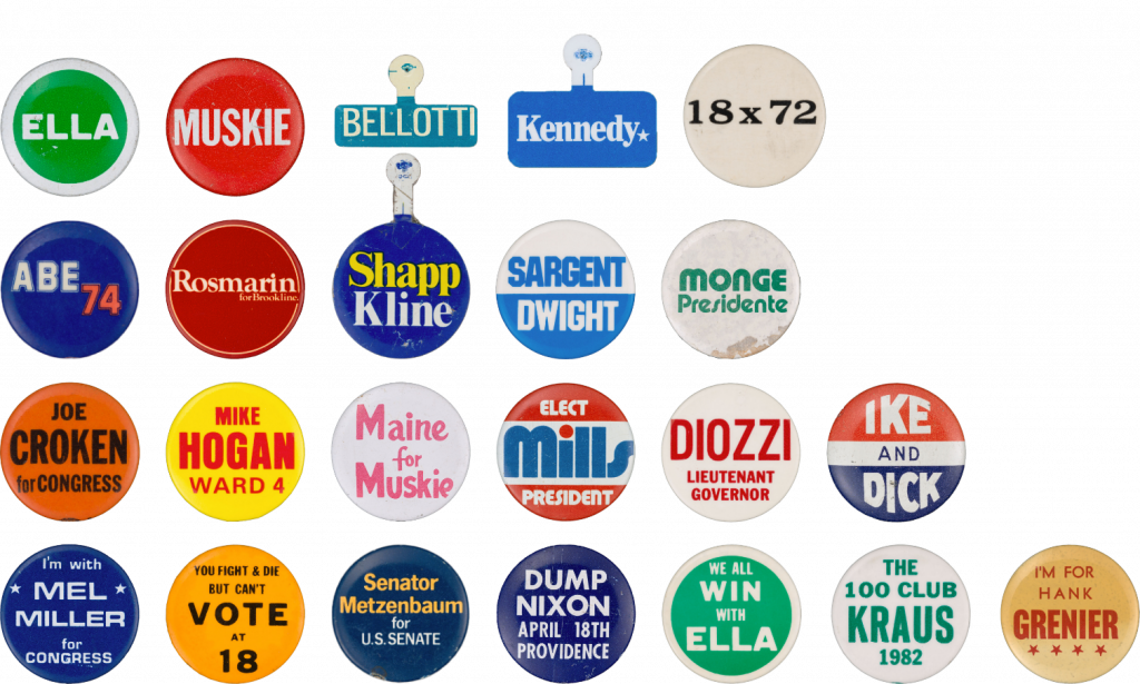
Sorting By Geographical Distribution
I categorized these pins by their geographic distribution to observe the political participation in different regions. I found that the pins I selected were basically election events in various states in the United States. Some pins could not find the specific source, and there were two pins from the former Soviet Union and one from Latin America, so I mainly displayed the map of the United States.
Directly linking specific regions with their political expressions allows me to more intuitively discover the political and cultural differences between these regions.
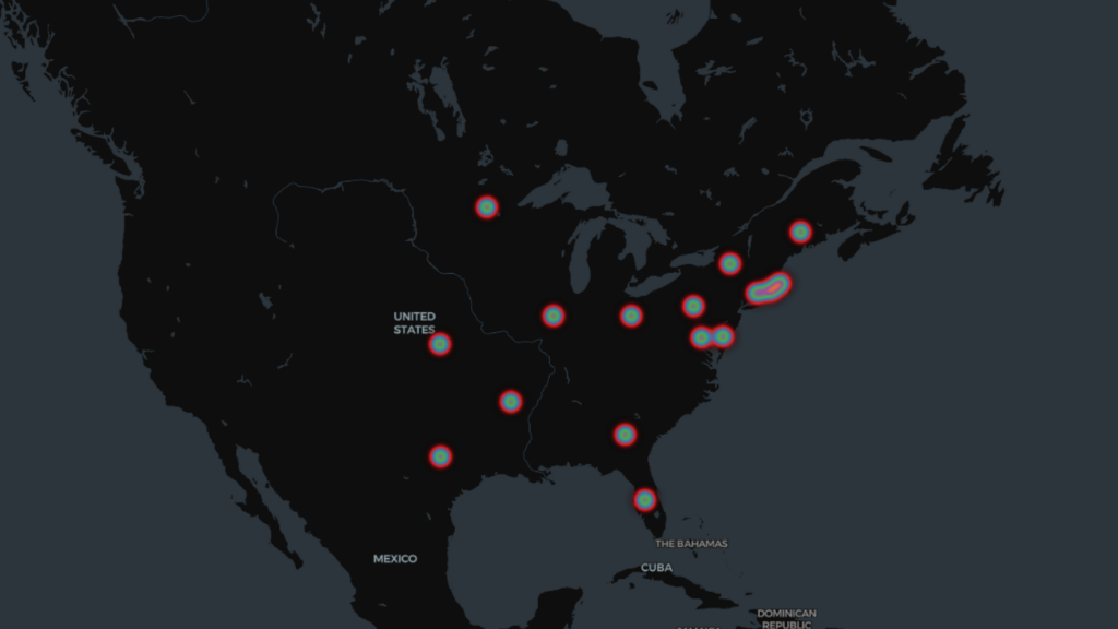
I compiled the latitude and longitude of each state along with the corresponding number of pins, resulting in this heat map for visualization.
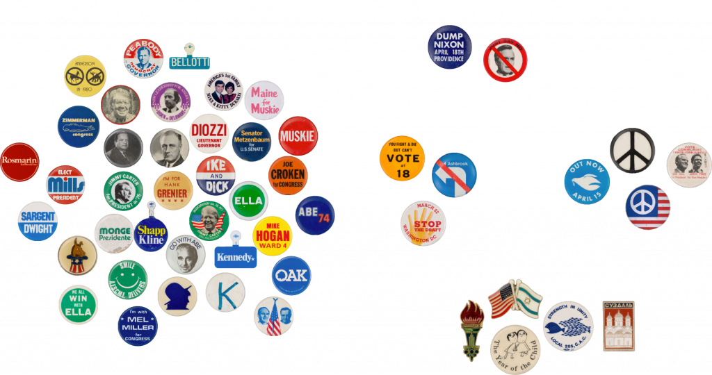
Sorting By Identifiable Grammar
I categorize the pins into three types: pure images, pure text, and a combination of images and text, with the aim of analyzing how they use visual and textual elements to convey information.
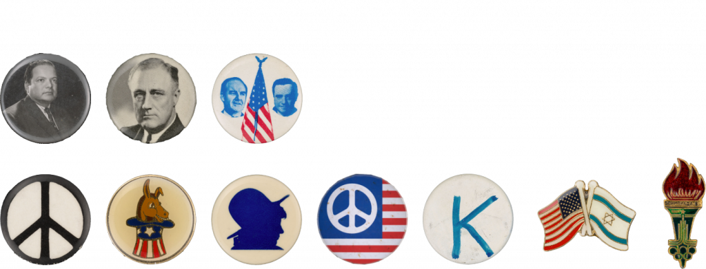
These pins rely primarily on visual symbols to convey information, quickly grabbing attention and stimulating emotions.
This type of pins mainly expresses opinions by displaying the names of candidates or concise sentences. It can directly convey political positions or emotions and achieve clear and unambiguous information transmission.
This combination combines the advantages of vision and language, providing a richer level of information and further understanding the relationship between images and text.
In my subsequent research, I found that the frequency of sans-serif typefaces was the highest, primarily because these fonts are more easily recognizable. However, upon further analysis of these typefaces, I realized that their styles are quite rich and diverse, with unique visual effects.
To better reflect the diversity of these typefaces, I decided to reclassify them based on their relevance to electoral politics. I created an alphabet where each letter represents the initial letter of a word from a pin.
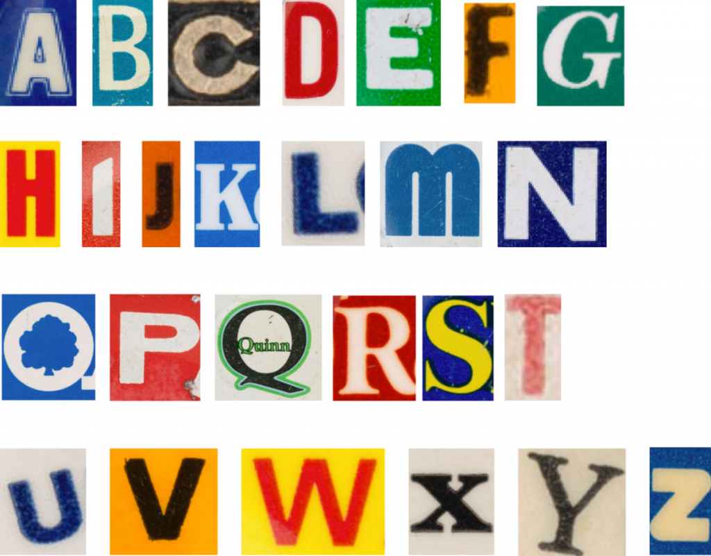
This alphabet not only showcases my organization of the content of the pins but also provides a clear framework for my research, helping me explore the visual language related to electoral politics in greater depth.
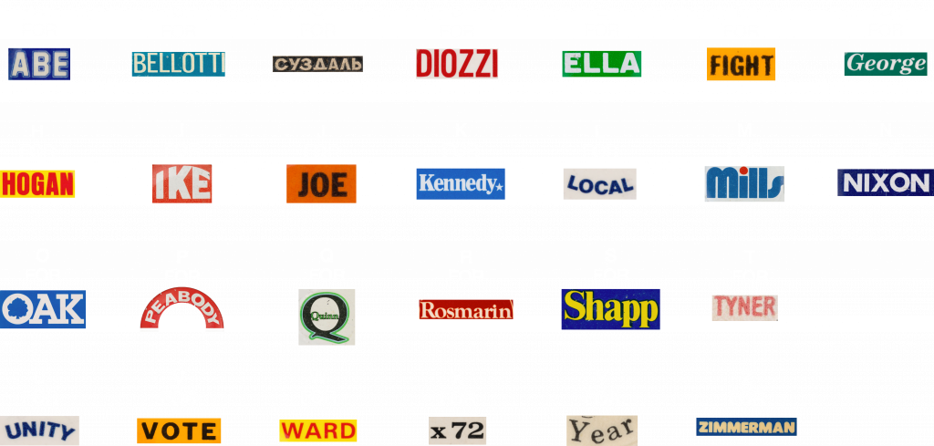
Next, I began to experiment with rearranging the original text on the pins using the new alphabet.
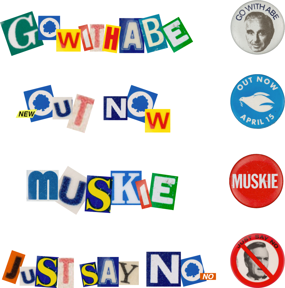
The original pin gave people an official and trustworthy feeling, presenting people as a reliable candidate. However, the collage text does not convey authority like a formal badge, but has a sense of spontaneity and instability. It no longer promotes a certain position with traditional and professional visual effects, but displays it in a casual and norm-breaking way. This makes the originally serious political information seem lighthearted and even a little funny, deconstructing the authority of political discourse, dispelling the solemnity of traditional political propaganda, and bringing a sense of irony.